

Color picker form element
Use the Color picker form element to add a Color picker and color palette to your Component form. For more information, see Create an editable component.
Always use the Color picker when making a color within your layout an editable field within your Component form. You cannot use a simple text input and ask editors to fill in a Hex value. The color selection within styles requires the color object provided by the color picker.
Locating the color picker form element
To find the Color picker form element:
- Navigate to a component
- Click the + button on the Component form builder
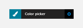
- Within the Fields tab, look for the Color picker form element.
The Color picker element includes the following fields:
Title field
- Provide a name for the form element. Important: This will be displayed in your component form.
Field settings
- Hide picker tab - Set to hide the color picker tab
- Colors allowed - Set what color are available in the color picker
- Allow all colors - Set to allow all colors in the color picker
- Restrict by specific colors - Set to restrict the color picker to specific
- Restrict to color tags - Set to restrict the color picker to specific color tags.
Default
- Default value (optional) - Select a default color for the Color picker.