

Configuring your responsive grid settings
DX8 allows you to configure your website grid and your responsive breakpoint widths.
Before you start
Before you set up your responsive grid it is helpful to understand some key concepts:
- How the breakpoints work. See Understanding the responsive breakpoints
- What Boxed width is. See What is boxed width?
- The difference between fixed and fluid grids. See Fixed vs. fluid grid
- What the responsive grid preview shows. See Understanding the responsive grid preview.
Set up your responsive grid
Step 1 - Choose desktop or mobile first:
- Navigate to DX8 > Website settings > Responsive grid settings
- Click on the Desktop or mobile first dropdown and select Desktop first or Mobile first
Also in settings is the number of columns which in this case is set to 12. You cannot change this setting
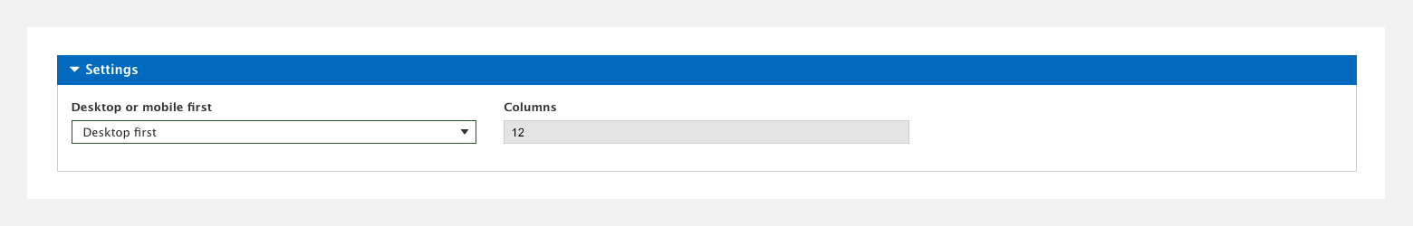
Once you've started building styles and layouts, changing the grid between Desktop and Mobile first will cause unexpected results and should be avoided.
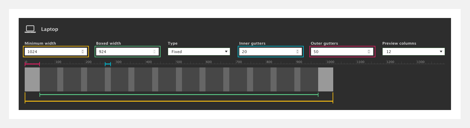
Step 2 - Enter your settings for each device width:
- Minimum width (highlighted in gold) - This sets the minimum width that any settings or styles for that breakpoint will apply
- Inner gutters (highlighted in blue) - This sets the gap between columns in your layout
- Outer gutters (highlighted in pink) - This sets a gutter to the outside of your layout so that the browser edges never touch the edge of your layout
- Boxed width (highlighted in green) - Once you've set your outer gutters you will see that the value in the Boxed width field is equal to your minimum width minus your outer gutters. You cannot edit this value directly. To change it you must change the minimum width or the outer gutter width
- Type - This refers to the way in which the grid changes from one breakpoint to the next. Set it to Fixed and the grid will snap from one breakpoint to the next. Set it to Fluid and it will scale gradually from one breakpoint to the next
- Click Save
Set up your responsive grid on an existing website
If you're using DX8 on an existing website, you will already have configured your responsive breakpoints within Drupal's YAML file and your website grid within your theme. DX8 does not work with or alter these settings.
Pages, styles and templates using DX8 will use DX8's responsive grid settings and breakpoint widths. If you want to match these to the rest of your website you can replicate the widths you've set within your YAML file and your theme within DX8's responsive grid settings.